The logo concept materialized out of two workshops at our studio with Third Angle New Music’s staff and marketing committee. The first workshop explored Third Angle’s core attributes, mission, aspirations and value to the community. At the second workshop each participant was asked to pull 5 favorites from a wall of inspirational images and to explain why their selections were meaningful and relevant to Third Angle. From these exercises emerged a logo concept that represents the intersection of new music, composition and collaboration across the dimensions of style, time and space.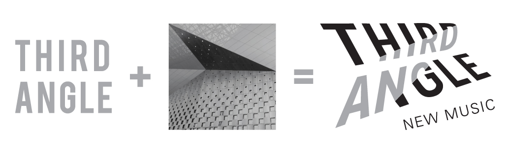 The logo design is based on overlaying the name Third Angle on a three dimensional tetrahedron grid. This folded topographic plane of triangles is inspired by the facade of one of the Chinese pavilions at the Shanghai World Expo that I saw during Third Angle’s first trip to China for the Beijing International Music Festival. Third Angle’s story and history is embedded in the new logo.
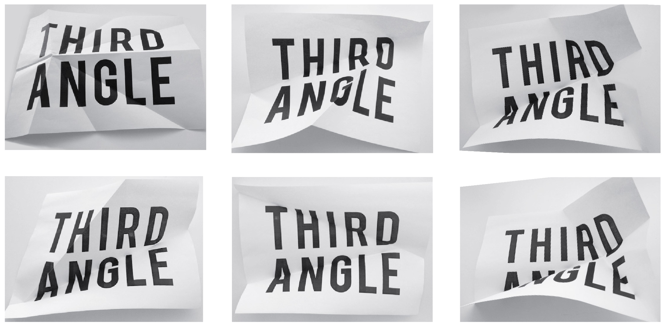 Original artwork was created using a piece of paper printed with the words Third Angle that was then folded and photographed, again and again. A final digital version emerged that met the range of application demands. A brand statement, tagline and graphic application standards were developed to bring the new identity to life.
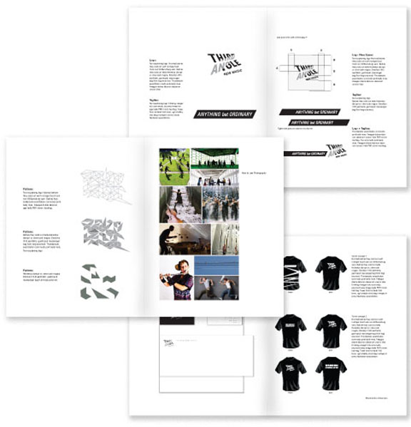 Michael Reed serves on Third Angle’s Board of Directors.